More than an Obituary
theMemories.com
theMemories.com is a digital alternative to an obituary. It allows a user to tell the whole story of the deceased. I redesigned their existing guestbook feature which hadn’t been updated since the launch of theMemories’ MVP.

Role
UI/UX Designer

Devices
Web & Mobile

Time Frame
Jun 2020 - Oct 2020


Initial Problem
Improving the MVP
theMemories.com is a digital alternative to an obituary. It allows a user to tell the whole story of the deceased. I redesigned their existing guestbook feature which hadn’t been updated since the launch of theMemories’ MVP.
Research
Talking with Users
I conducted user interviews asking participants a variety of questions about their emotions, feelings, and needs after they had lost someone in their life. It allowed me to empathize and understand the spectrum of emotions experienced in grief. I organized my research into a set of emotions, needs, and feelings.

Research
Defining Needs
Based on the information gathered from user interviews I had a list of emotions and feelings of those in grief. I performed a card sorting exercise to organize my data. I ended up with three mindsets behind the emotions, I considered these my three loose user personas. I created User Need Statements to help me align my data into actionable tasks to achieve with my design.
Sad Mindset
Rita, a tearful widow needs to reflect on the life of her late husband through pictures in order to find closure and peace in bereavement.
Lost Mindset
Lost Mindset
Lost Mindset
Lost Mindset
Trish, a suffering, shy friend of the late Martin needs a way to share how much he meant to her in order to feel connected and together.
Deep Pain Mindset
Zach, a devastated son who suddenly lost his father in a tragedy needs to read through memories from his father’s friends in order to connect
and move on.
Validation
Testing the User Experience
After I had the green light from my Stakeholders to proceed with wireframes I built a high-fidelity prototype to test for usability. During testing I received a lot of great feedback and uncovered some usability issues. I used this feedback to improve my designs and build a better experience.


1
1
Confusing Button
Clicking the sign the guestbook button to expose the guestbook form seems unnecessary.
1
Like Button
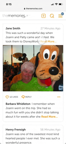
It would be nice to be able to like a Guestbook entry that way I can support a thoughtful entry when I’m at a loss of words.
2
When is this from?
It’s hard for me to see when these were posted.
3
Comment Field
The comment field on each Guestbook entry is distracting.

1
3
2

1
2
1
Weird Flag
This flag being so prominent makes me think I should click it. But isn’t reporting something bad?
2
Too Much Text
The longer Guestbook entries seem too long for me at first and make me not want to read.

Final Designs
Helping Users Connect
After conducting usability testing I gathered some really insightful feedback about my prototype. I adjusted my designs to alleviate pain-points and adding features I discovered users wanted. These tweaks included hiding the comment section under a reply button and adding a like button to other user's posts.